
When it comes to designing visually appealing and user-friendly content, Fonts plays a pivotal role. The right font can enhance the message, build your brand, evoke emotions, and even reflect the brand’s personality. Google being the major tech giant mark its presence significantly. Google Fonts has emerged as a game-changer, offering an extensive collection of high-quality, open-source typefaces that are visually captivating and incredibly versatile.
Fonts are a crucial part of your brand as a whole, as it affects and boost the feeling of your potential users for their belongingness with the brand (and, therefore, the buying decision process).
What are the Google Fonts?
Google offers a robust collection of web fonts you can use for any type of project online and offline. One of the most compelling aspects of Google Fonts is the absolute range of its collection. With over a thousand fonts available, ranging from elegant serifs to modern sans-serifs and quirky display fonts, Google Fonts caters to every design need. Their vast selection ensures that designers can find the perfect font to match their project’s tone, style, and purpose. Here we have selected the 10 most popular ones, widely used in web content. They are free and open source where you can use them for a logo design, printing material, apps, web pages, booklets, e-books, etc.
Open-Source Advantage
One of the most remarkable aspects of Google Fonts is its open-source nature. All the fonts in the collection are distributed under open licenses. This means that designers can freely utilize these fonts as well as they can modify, share, and even create their own versions.
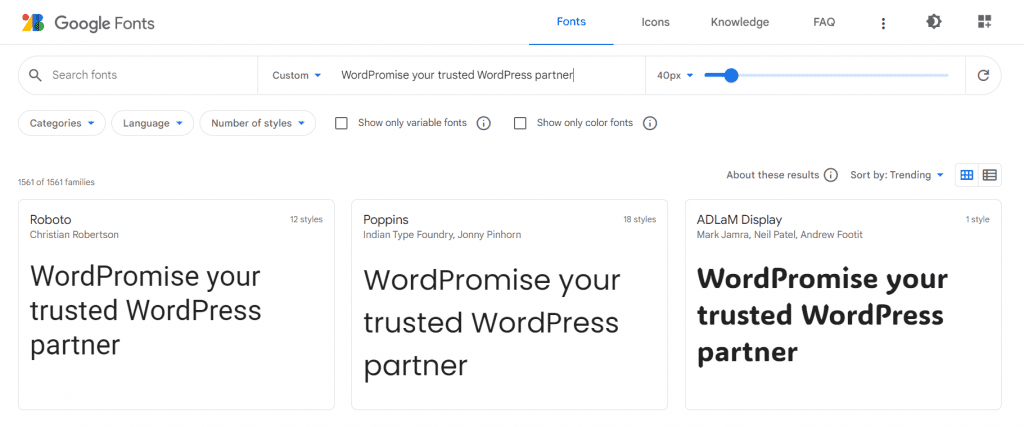
You can explore the perfect Google Fonts by using the search box and the different filters available:
What to consider before choosing Google Fonts on WordPress?
Readability & Accessibility
Readability and accessibility are crucial considerations when choosing fonts for any type of content, whether it’s printed material, digital interfaces, or websites. Fonts play a significant role in how easily users can consume and understand the information presented. Here are some key points to keep in mind for enhancing readability and accessibility through font selection:
- Contrast: Ensure a strong contrast between the text and the background.
- Font Size: Use an appropriate font size that allows most users to comfortably read the text without zooming or straining their eyes.
- Font Style: Opt for fonts with clear and distinct letterforms. Avoid extra stylish or decorative fonts for body text, as they may distract the overall context.
- Line Spacing: Maintain an adequate line spacing (line height) to prevent overcrowding of text.
- Font Weight: Use a variety of font weights (e.g., light, regular, bold) to emphasize different levels of content.
- Font Color: Choose text colors that contrast well with the background color. Black or dark gray text on a white background is a classic choice.
- Testing: Always gather feedback from diverse users, including those with different visual abilities, to ensure your font choices cater to a wide range of readers.
- Responsive Design: If your content will be viewed on various devices, make sure the fonts are responsive and adapt well to different screen sizes without sacrificing readability.
- Simplicity: Generally, simple and clean fonts tend to be more readable across different mediums and contexts. Save highly decorative fonts for headings and branding, and prioritize readability for body text.
Look-and-feel as per your brand, industry standard
Each font has its own vibes & impact on the viewer’s emotions when they see the content. You can’t use the same font for a school website v/s a luxury product website: the look & feel of your font, is the first thing that matters. Similarly, if you want to create a website for kids, you should opt for a friendly and easy-going font which they can better co-relate. But if your client is more of a professional brand, then the font should express bold style with sophistication.
The Best and Most Popular Google Fonts in 2023
In 2023, the 10 best and most popular Google Fonts for a WordPress site are the following:
Let’s check out the list of the best free Google fonts that are freely available for your personal as well as commercial projects.
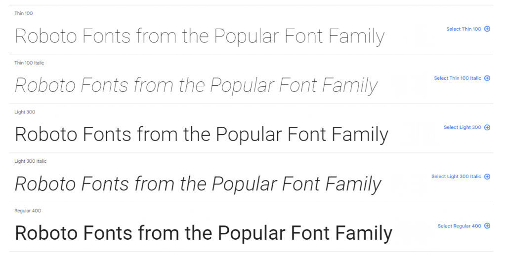
1. Roboto
Roboto is available via an open-source license. Roboto is specifically designed for use on screen and has been designed to balance content density with reading comfort. Roboto has it both geometric but with some friendly open curves.
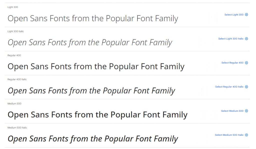
2. Open Sans
Open Sans was designed with an upright stress, open forms and a neutral, yet friendly appearance. It was optimized for print, web, and mobile interfaces, and has excellent legibility characteristics in its letterforms.
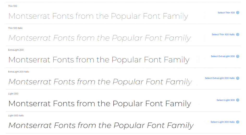
3. Montserrat
Montserrat has become increasingly popular among web designers, and it is used on over 15 million websites. Featuring a large x-height, short descenders and wide apertures, this typeface achieves high legibility even in small sizes.
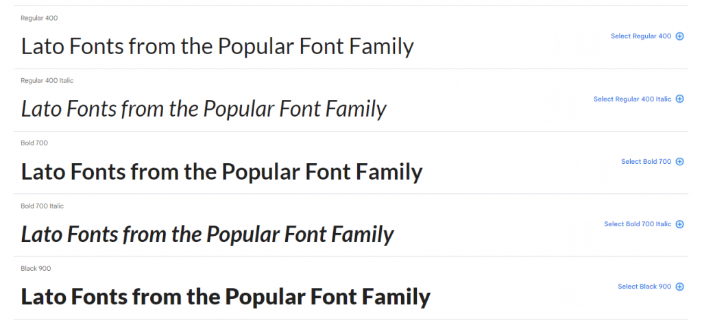
4. Lato
The Lato Font Family is a free sans-serif typeface that has become popular due to its unique balance of originality and transparency when used in body text.
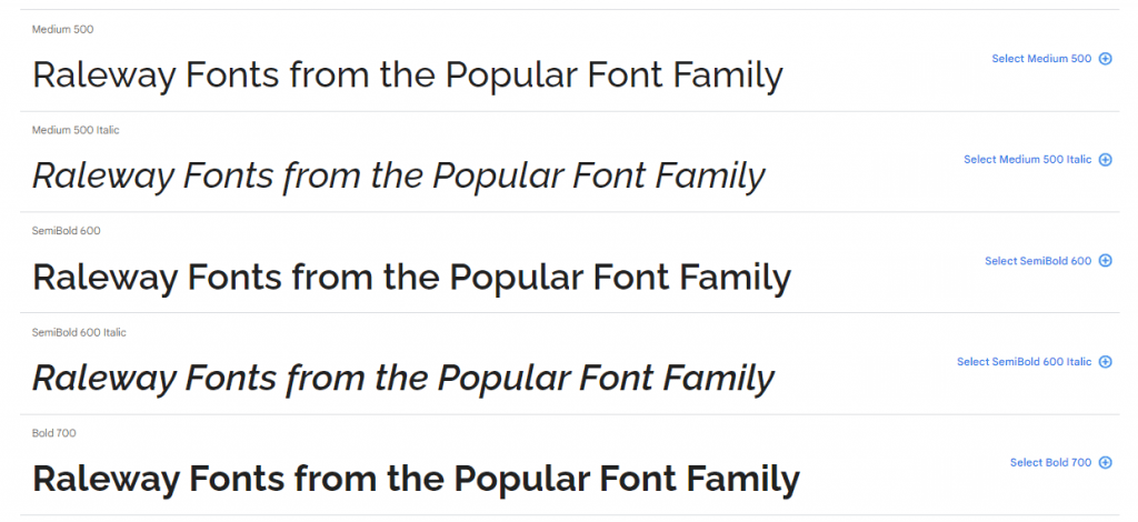
5. Raleway
Raleway is an elegant sans-serif typeface family intended for headings and other large size usage. This font would be the ideal choice for all different types of modern and old-style designs.
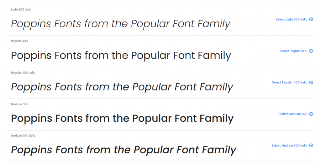
6. Poppins
Poppins is a sans serif font that can handle characters from Latin alphabets and the Devanagari system used by languages like Hindi or Sanskrit. If you’re looking for an internationally versatile font, Poppins is a great choice.
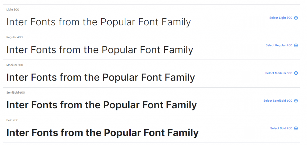
7. Inter
Inter UI is a typeface specially designed for user interfaces with a focus on high legibility of small-to-medium sized text on computer screens. The family features a tall x-height to aid in readability of mixed-case and lower-case text.
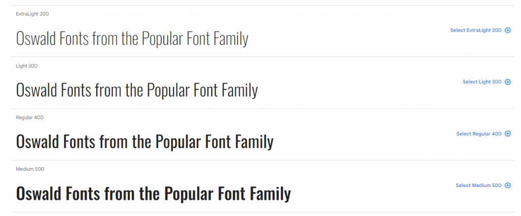
8. Oswald
Oswald is a sans serif typeface that can combine easily with nearly any other serif or sans serif. It is that attractive and amenable. Because it is slightly elongated, it always brings contrast to a typography combination.
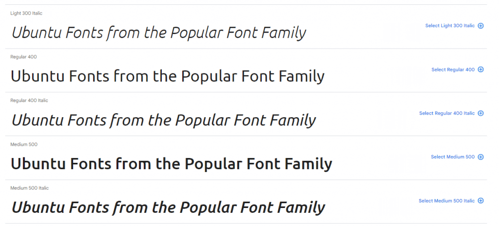
9. Ubuntu
The Ubuntu font family is a sans-serif typeface family available in 22 styles plus a variable font with adjustable weight and width axes.
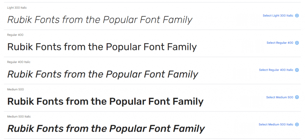
10. Rubik
Rubik can be used both digitally and in print. Rubik is a sans serif typeface with slightly rounded corners that works well for lengthy blocks of text. The Rubik font family contains a range of weights that make it ideal for both subheads and body copy.
Conclusion
Google Fonts has revolutionized the world of typography by providing designers and developers with a vast collection of high-quality, open-source fonts.
Remember that your font must be aligned with your requirements & your brand’s impression you want to have: serif fonts are popular with brands that want to portray an elegant and sophisticated image.
Its diverse range of typefaces, commitment to quality, and seamless integration make it an invaluable resource for anyone involved in design and content creation.
By democratizing typography and eliminating the barriers of cost and licensing, Google Fonts empowers the digital world. Whether for websites, branding materials, or print design, Google Fonts has something to offer that fuels creativity in the ever-evolving world of design.
Finally, the golden rule is not to use too many fonts and to optimize them as much as possible.